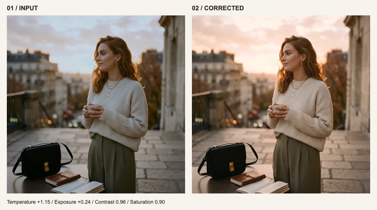
You save a look from the first image. The second stays blue; the third becomes too warm. Identical values applied to different inputs do not automatically produce a matching appearance. This downloadable exercise makes that difference visible.
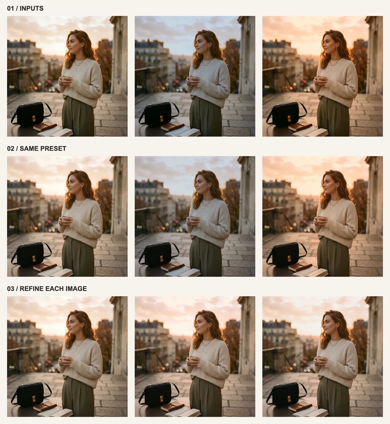
All three columns originate from the same site artwork. The casts and brightness differences are deliberately introduced, not photographs taken under three real lighting conditions. Results use the editor’s actual white balance and adjustment filters. Mixed light, reflections and local exposure differences make real sets more complex.
Download reference A, cool dark B, and warm C. Work through them individually in the same browser.
1. Define a look you can describe
Our target is slightly warm, with softer contrast and restrained color. Use A as the reference and inspect the light shirt, face and warm background. For product images, prioritize the product’s actual color. A scene lit by warm light does not necessarily need every white object to become neutral.
| Reference point | What should feel consistent | What can differ |
|---|---|---|
| Skin or product color | No single image suddenly looks orange or green | Temperature values |
| Subject brightness | No image jumps out as unusually dim or glaring | Night and daylight brightness |
| Color intensity | No image looks much more saturated than the set | The colors of different backgrounds |
2. Build the preset on A
Open A. Set Temperature to +0.25, Exposure to +0.04, Contrast to 0.96, and Saturation to 0.90. Leave the other controls at default. Click Save preset in the bottom toolbar and name it “Practice · soft warm”. Find it in the personal preset area under Filters.
3. Apply it to B and C, then correct each
Export A before opening B. Apply the saved preset: the middle image in row two still looks cool and dim. On C, the same preset adds more warmth. Change the final values to the following settings to reproduce row three.
| Control | A / reference | B / cool and dark | C / warm |
|---|---|---|---|
| Temperature | +0.25 | +1.15 | −0.65 |
| Exposure | +0.04 | +0.24 | +0.04 |
| Contrast | 0.96 | 0.96 | 0.96 |
| Saturation | 0.90 | 0.90 | 0.90 |
B needs more warmth and brightness; C needs a shift back toward cool. Contrast and Saturation keep the same starting point. Inspect fabric and skin, then view the set together at a smaller size instead of judging one slider in isolation.
4. Refine your own images by symptom
| After applying the preset | Next adjustment | Inspect |
|---|---|---|
| The whole image is yellow or blue | Temperature | Whether neutral fabric and skin both improve |
| Green or magenta cast | Tint | Faces and gray or white areas |
| Dark subject with bright highlights | Try Shadow brightness first | Subject readability and highlight texture |
| Overly intense skin | Reduce Saturation and inspect Temperature | Avoid adding warmth to hide a cast |
| One side warm, one side cool | Accept the difference or use local correction tools | Global white balance may not fix both light sources |
The +1.15 setting is specific to B, not a recipe for every indoor image. With real scenes, let the picture determine the values. Separate daylight and warm-indoor presets may be more useful than forcing one preset onto every situation.
Three limits to remember
- Personal presets live in the current browser. They do not sync across devices, and clearing site data can remove them.
- Text, brush work, liquify, color-replacement rules, watermarks and cropping are outside this filter preset. It is not an image backup.
- This workflow applies and exports one image at a time. The preset does not automatically analyze and batch-match an entire set.
Continue with measured export examples, or practice the basic controls in the single-image walkthrough.