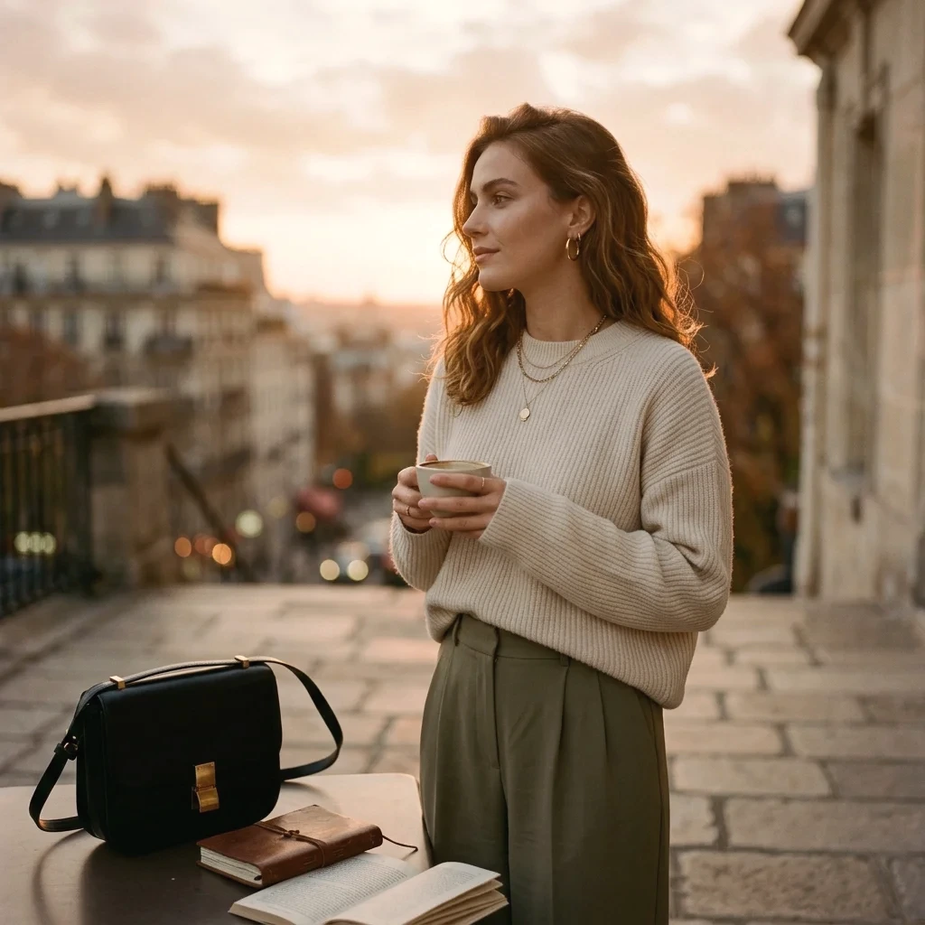
The task is specific: make a dark, cool portrait practice image brighter and more coherent in color, then prepare it for an article. Here is the result we are working toward.
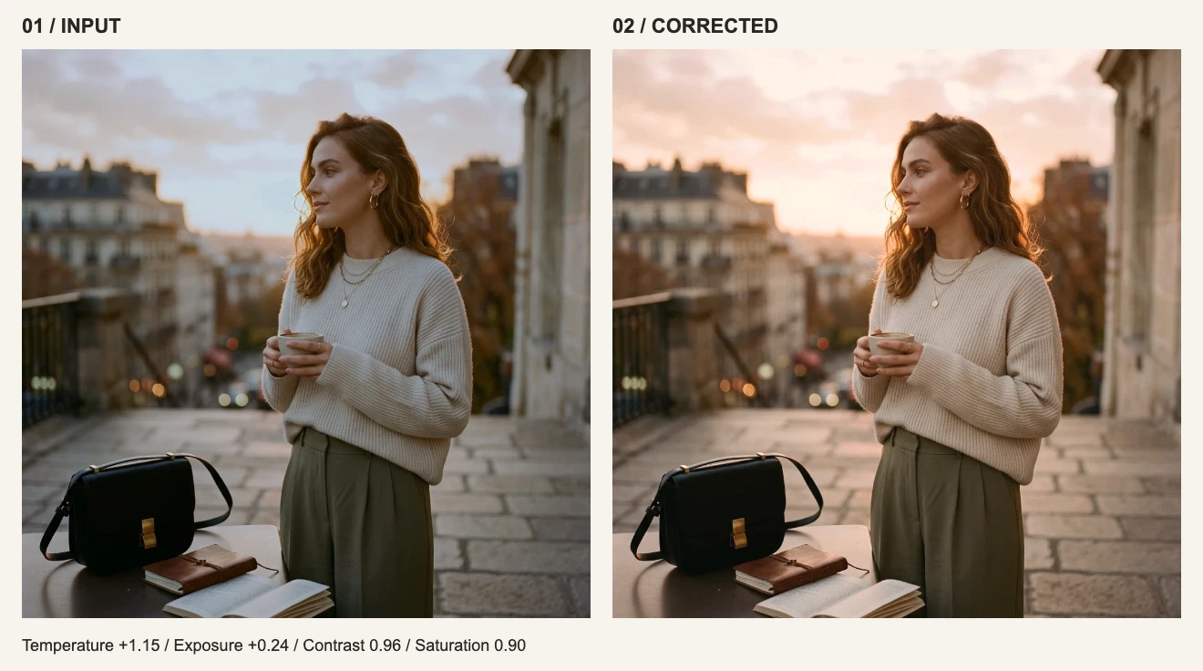
This is a controlled demonstration. We made a cooler, darker version of existing site artwork, then rendered the correction with the actual white balance and adjustment filters used by the editor. It is not a before-and-after account of a real photo shoot. Open the practice input in a new tab and save it to your device to follow along.
1. Find two places you can judge
After opening the image, look at the light shirt and the face. Both have a cool cast, which makes white balance a useful starting point. The subject is also dim enough to try a modest exposure increase. The background contains warm evening light; making every part of the scene neutral would lose that atmosphere.
| What you see | First control to try | Stop when |
|---|---|---|
| The whole image is dark | Exposure | The subject is readable and the light shirt still has folds |
| Light fabric and skin both look blue | White Balance → Temperature toward warm | The blue cast recedes without turning skin orange |
| Only the shadows are too dark | Shadow brightness | Details become visible without flattening the picture |
| One object has an unexpected color | Check the light and the object itself | Avoid shifting the entire image to fix a single object |
2. Enter four settings and inspect each change
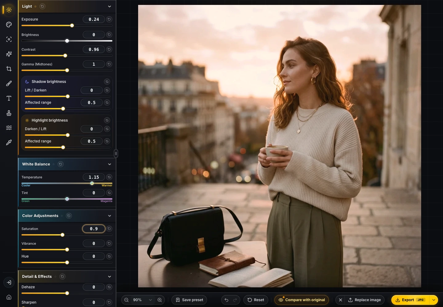
Use the light and color controls in the left panel. Temperature and Exposure default to 0; Contrast and Saturation default to 1. Temperature here is a relative editor value, not a Kelvin measurement.
| Control | Practice value | Purpose in this image |
|---|---|---|
| White Balance → Temperature | +1.15 | Counter the blue cast while retaining a little warmth |
| Exposure | +0.24 | Lift the subject |
| Contrast | 0.96 | Slightly soften the light–dark separation |
| Saturation | 0.90 | Keep the warmer skin and background from becoming too intense |
Compare with the original after each change. Is the face easier to read? Can you still see fabric texture? Does the background compete with the subject? If your own picture is only slightly dark, changing Exposure alone may be enough. These four values belong to the supplied practice input.
3. Crop for the destination
The comparison keeps the square composition so you can inspect the same areas on both sides. If your article needs a landscape image, open Crop, choose its required ratio, and reposition the frame. Check the head, hands, and space around the subject before applying it.
Cropping before color work is also reasonable. This exercise delays it so you can reproduce the full-frame comparison first. After a crop, check the balance between the subject and the remaining background again.
4. Export, then reopen the file
The source is 1024 × 1024. For an article slot up to about 512 CSS pixels wide, keeping 1024 pixels is a reasonable starting point for a 2× display. Enlarging it to 2400 pixels just to call it high resolution adds no original detail.
- If the destination accepts WebP, start at quality 85 and the pixel dimensions you actually need.
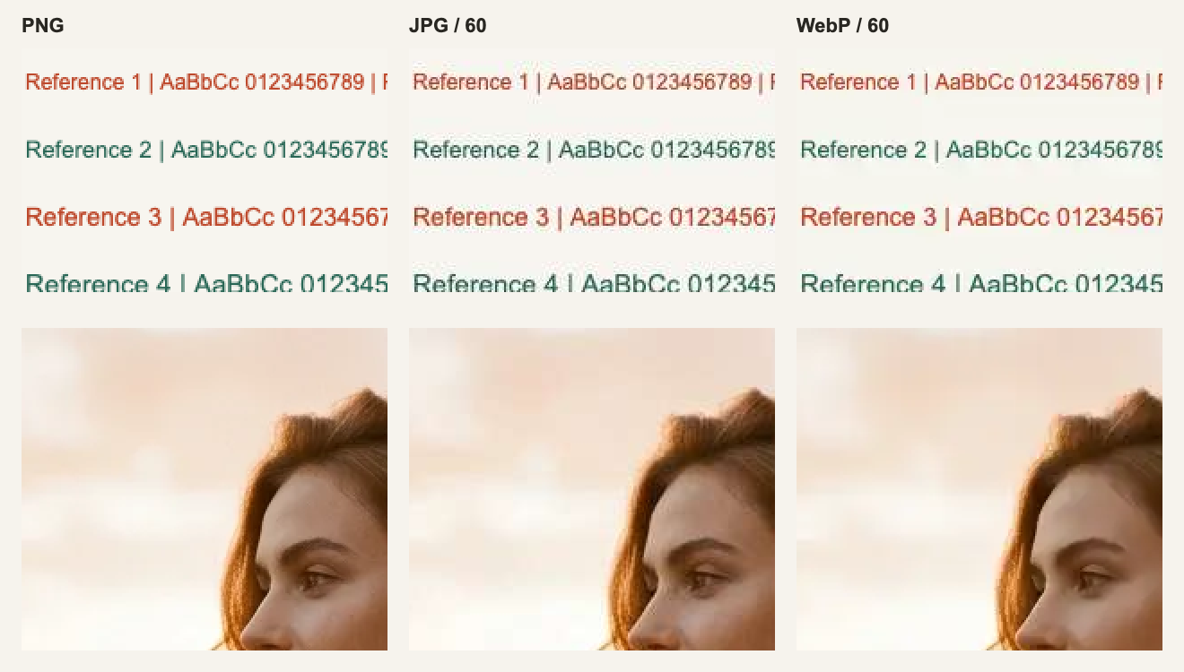
- Use JPG when the upload system rejects WebP. Keep a PNG when you need a lossless flattened intermediate.
- Reopen the downloaded file. Check dimensions, face and clothing edges, then inspect it in the actual page.
- Keep the original source. An export is neither a source replacement nor an editable project with the complete operation history.
For measured file sizes, read the export guide. For a set of images, continue with why the same preset needs individual corrections.
Where this workflow fits
This workflow covers composition, tone, global color and delivery of one raster image. Detailed masks, healing, multilayer compositing and editable multipage layouts require tools that provide those features. Image processing runs locally, while page resources, accounts and quota checks may still need network requests.